Everyday Life at the Crossing
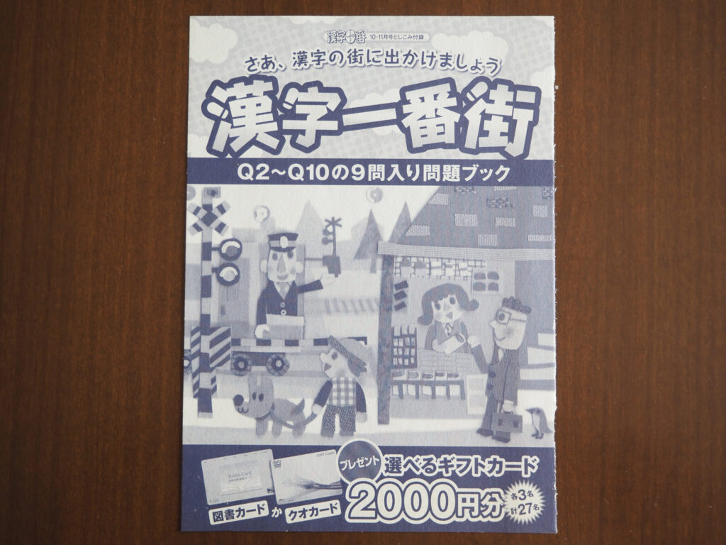
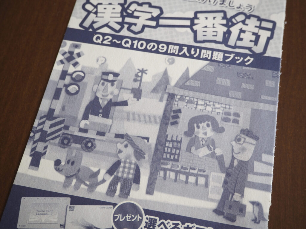
雑誌の中綴じ付録のクイズの表紙です。
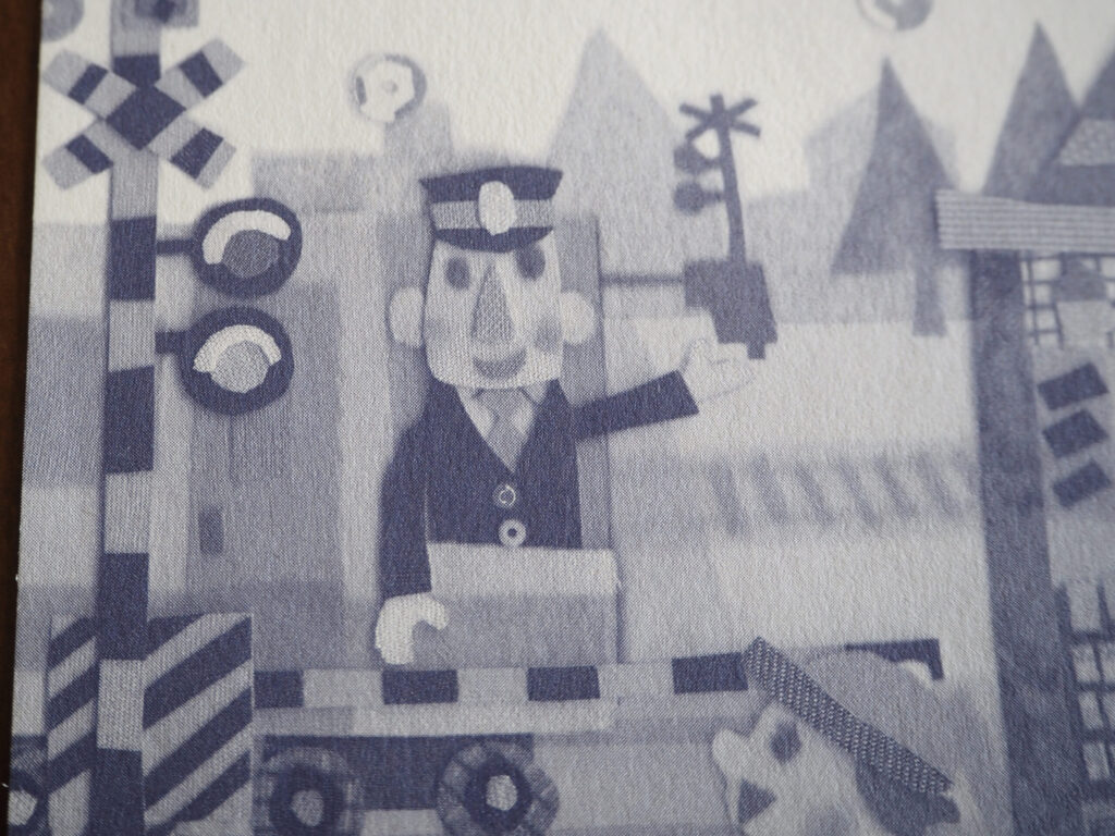
小さな駅の近くの踏切りでの、素朴な日常の様子です。
モノクロになることで、意図せず昭和風の懐かしげなムードになりました♪
This is the cover illustration for a quiz booklet included as a center insert in a magazine.
It shows a simple, everyday scene at a railroad crossing near a small local station.
Rendered in black and white, it unexpectedly took on a nostalgic, Showa-era atmosphere♪
踏切りを過ぎて行く電車から少年に手を振る車掌さん。
A train passes through the crossing, and a conductor waves to a young boy from inside the train.
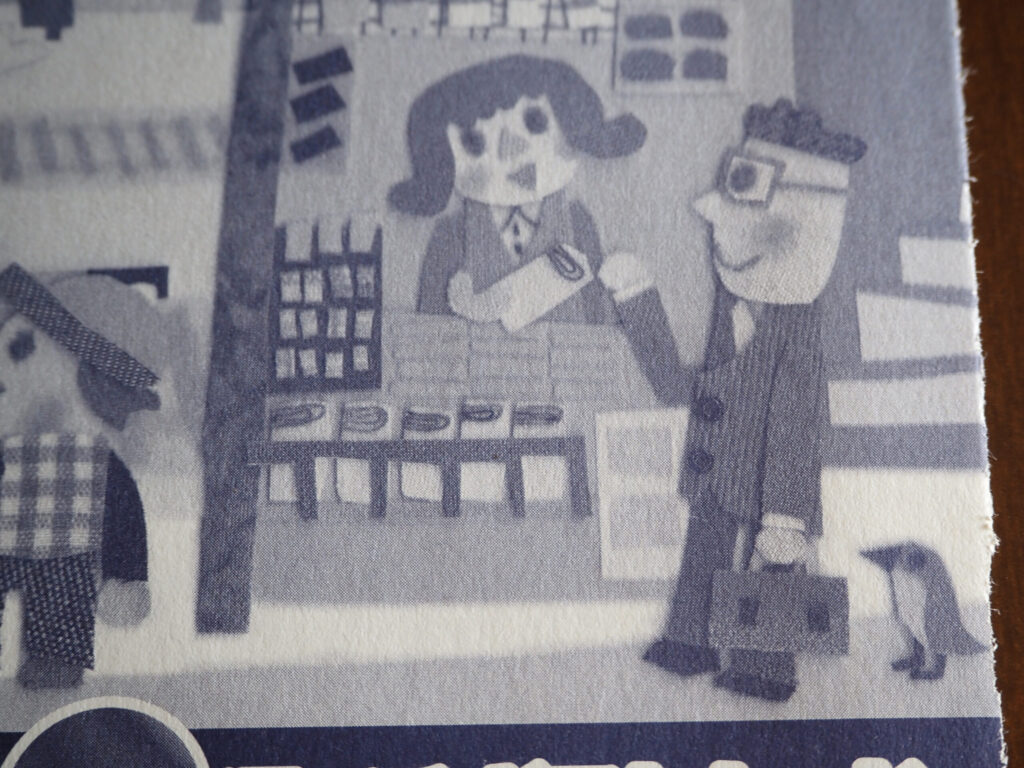
キオスクで新聞を買うサラリーマン。
折りたたんだ新聞の上面は糸で表しました。
サラリーマンの後ろには鳥さんが立っています。
新聞を買おうと並んでるのかな?
A businessman buys a newspaper at the kiosk.
The folded edge of the newspaper is expressed with thread.
Behind him stands a little bird— perhaps waiting in line to buy a newspaper too?
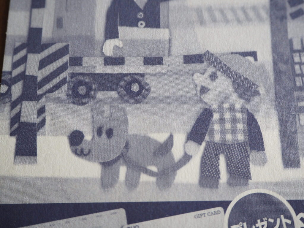
踏切りの前で待つワンちゃんのお散歩中の少年。
少年は電車を見ているのも楽しいようです。
In front of the crossing, a boy out walking his dog waits patiently.
He seems to be enjoying watching the train go by.
モノクロは、色が少ないから簡単と思われることも多いですが、グラデーションだけで表すのは逆に難しかったりします。
布や紙の素材でモノクロで表すのに悩みながら作っていたのを思い出しました。
Black-and-white work is often thought to be easier because it uses fewer colors, but expressing everything through gradation alone can actually be quite challenging.
I remember struggling to represent monochrome tones using fabric and paper materials.
この中綴じのお仕事も複数回携わったので、また他の回のものも紹介しますね!
I worked on this center-insert project several times,
so I’d like to introduce illustrations from other issues as well someday!